Neutral Color Palette Guide (Warm vs Cool Neutrals + How to Match Them)
Why neutrals go wrong (the honest reason)
People think “neutral = safe.”
But neutrals can look:
- yellow and old
- gray and cold
- dirty/muddy
- mismatched (undertones fighting each other)
The fix is simple: undertones + consistency.
10-Second Cheat Sheet
- Pick warm OR cool as your base (don’t mix randomly)
- Match undertones (yellow/pink vs blue/green)
- Use 60/30/10 formula
- Add texture so neutrals don’t look flat
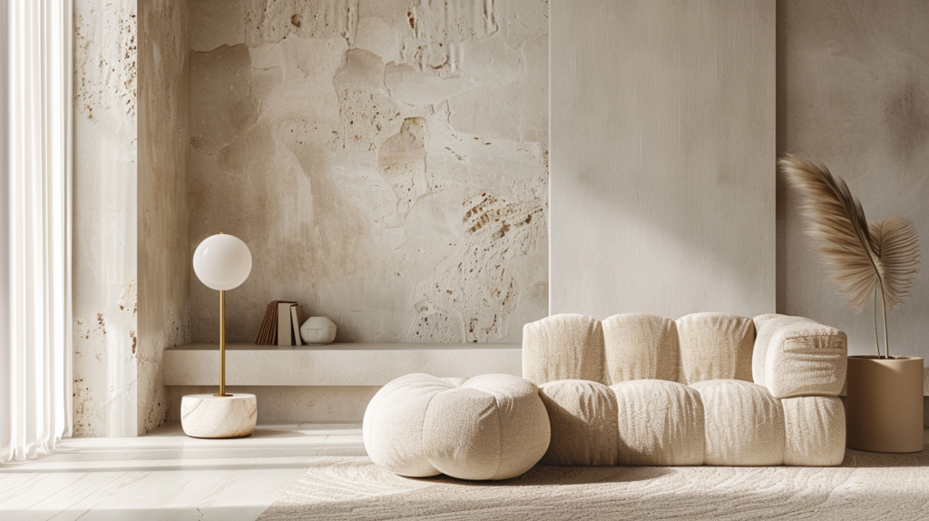
1) Warm vs Cool Neutrals (super simple)
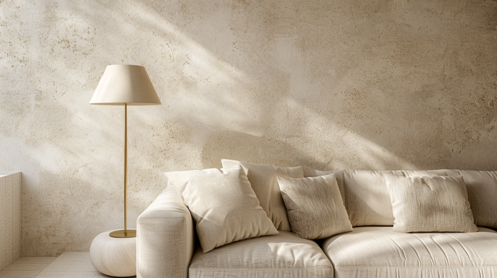
Warm neutrals
Feel cozy, soft, “hotel warm.”
- beige
- cream
- sand
- warm greige
- taupe (usually warm)
Cool neutrals
Feel crisp, modern, sometimes “minimal cold.”
- cool gray
- blue-gray
- white with blue undertone
Real talk: Warm neutrals are easier to make “expensive” in most homes.
2) Undertones: the secret that decides everything
Two whites can look totally different because of undertones.
Common undertones you’ll see
- Warm: yellow / red / pink
- Cool: blue / green
If your neutrals fight each other (wall looks warm but sofa looks cool), the room feels off.
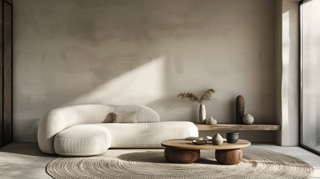
3) The 60/30/10 Neutral Formula (always works)
Use this for any room:
- 60% Base: walls + large surfaces (main neutral)
- 30% Secondary: big furniture (sofa, curtains, rug)
- 10% Accent: black/brass/wood/olive/terracotta (small touches)
Example (warm neutral):
- 60% warm off-white walls
- 30% greige sofa + natural rug
- 10% matte black + oak
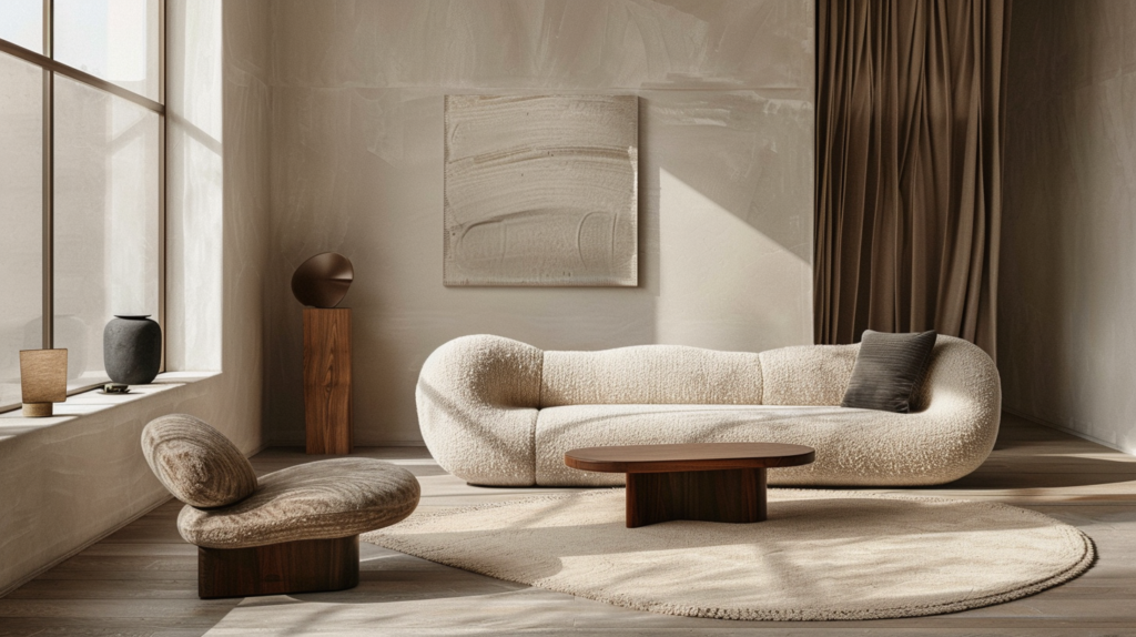
4) “Designer Palettes” you can copy (easy wins)
Palette A: Warm Minimal (safe + expensive)
- off-white + warm greige + light oak + matte black
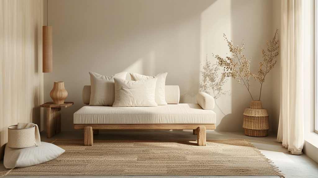
Palette B: Japandi Calm
- warm white + taupe + oak + soft charcoal
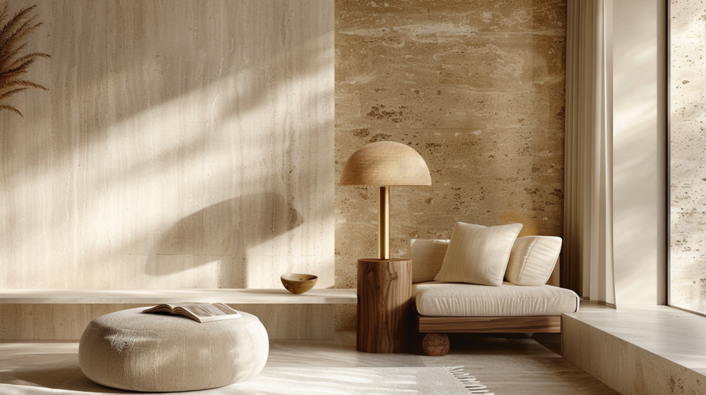
Palette C: Modern Luxury Neutral
- creamy white + beige + travertine tones + brushed brass
Palette D: Soft Boho Neutral (not messy)
- warm white + sand + rattan tones + muted terracotta
5) How lighting changes neutrals (don’t skip this)
The same wall color can look different in different rooms because of:
- daylight direction
- warm/cool bulbs
- shadows
Rule: choose your neutrals using the lighting you actually use at night (your bulbs matter).
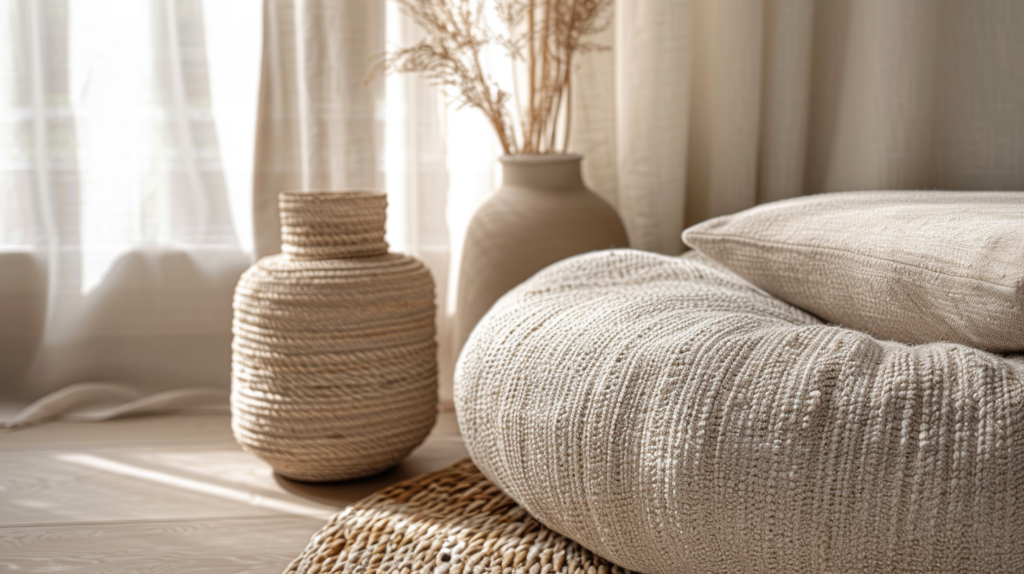
6) How to avoid “flat neutral” rooms
Neutrals look expensive when you add texture:
- linen curtains
- textured rug
- boucle/ woven upholstery
- wood grain
- stone/ceramic
Rule: aim for at least 3 textures in one room.
7) Common neutral mistakes (and fixes)
Mistake 1: Too many random neutrals
Fix: choose one base and repeat it.
Mistake 2: Mixing warm and cool by accident
Fix: keep all major items in the same undertone family.
Mistake 3: Gray everywhere (looks cold)
Fix: add warmth with wood, warm lighting, and cream tones.
Mistake 4: Beige everywhere (looks boring)
Fix: add contrast: black, charcoal, or one muted accent color.
Quick Checklist (copy/paste)
- Warm or cool base decided
- Undertones matched (no fighting)
- 60/30/10 palette used
- At least 3 textures added
- Same tone lighting in the room
FAQ
Q1: Can I mix warm and cool neutrals?
Yes, but do it intentionally: keep one dominant (80%) and use the other as a small accent (20%). Random mixing looks wrong.
Q2: Why does my white wall look yellow?
Warm lighting or a warm undertone in the paint. Try warmer-neutral whites instead of strong cream, and check bulb temperature.
Q3: How do I make neutrals look modern, not boring?
Add contrast (matte black/charcoal), clean lines, and texture.
Want me to build your palette?
Send me:
- 1 photo of your room
- the vibe (minimal / japandi / modern luxury / boho)
- and what you hate (too yellow / too gray / too dark)
…and I’ll give you a ready palette.