Wall Art Size Guide (So It Actually Fits Your Wall)
Why wall art looks “wrong” in most homes
It’s usually one of these:
- art is too small for the wall
- art is hung too high
- spacing is random
- frames don’t relate to furniture size
Fix the rules and your whole space instantly looks more expensive.
10-Second Cheat Sheet
- Hang art at eye level (not near the ceiling)
- Size it to the furniture under it
- Bigger is safer than tiny
- Keep spacing consistent
1) The #1 rule: Eye-level height
Center of the artwork should be around eye level when standing.
Most people hang art too high because they’re “centering it on the wall.” Don’t.
Quick method
- Imagine a line at eye level across the room
- The center of the artwork should sit on that line
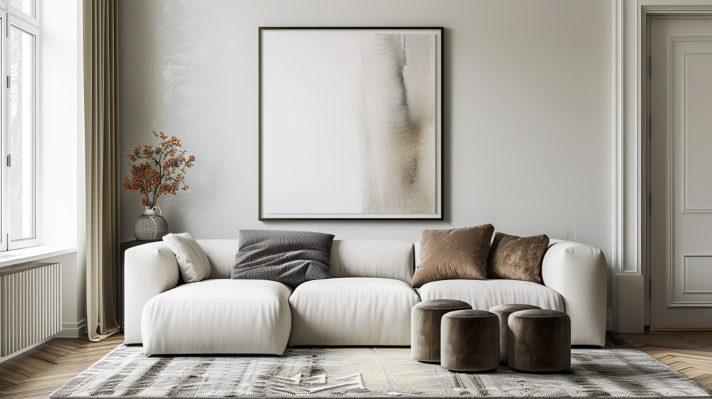
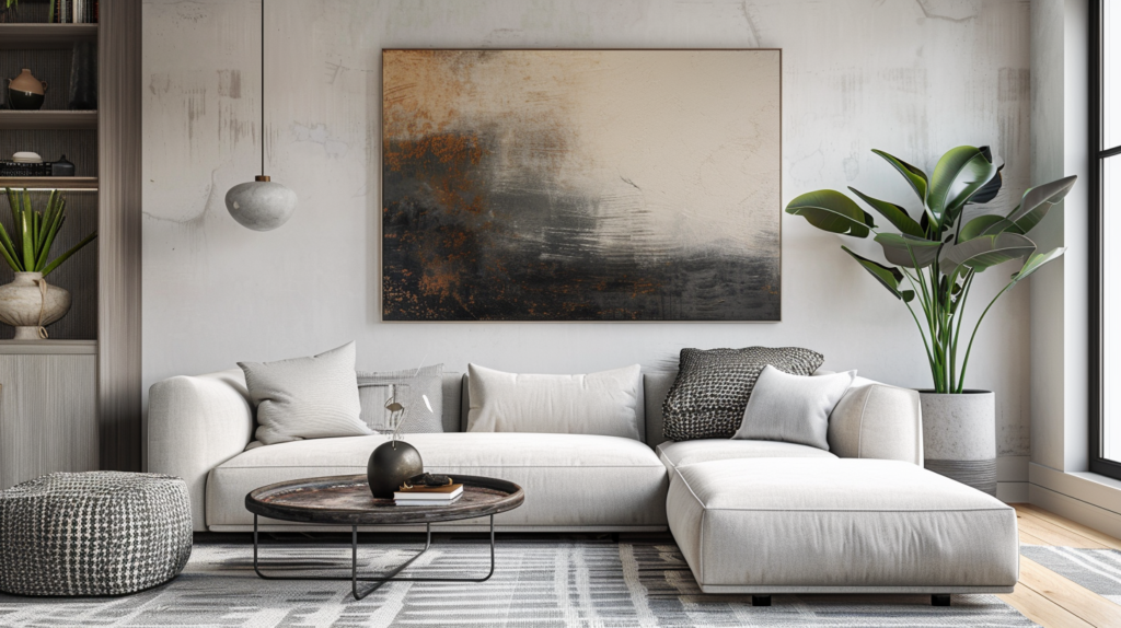
2) Art above a sofa (most important wall in the living room)
Size rule
Your art should be about 2/3 to 3/4 of the sofa width.
Examples:
- Sofa 240 cm wide → artwork width ~160–180 cm
(One big piece or a set that totals that width)
Spacing rule
- Keep the bottom of the art about 15–25 cm above the sofa
Not floating too high.
3) Art above a bed (same logic)
Size rule
Art above the bed should also be about 2/3 of the bed width.
Placement rule
- Keep it visually connected to the headboard
- Don’t push it near the ceiling
Designer tip: One large piece looks more premium than three tiny frames.
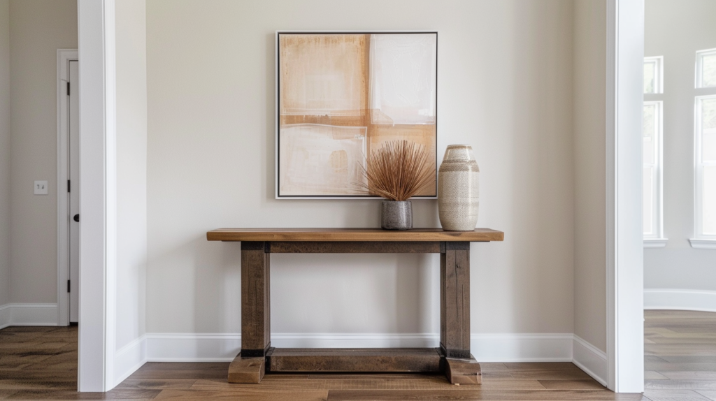
4) Art above a console table (entryway or dining)
Size rule
Artwork width should be about 2/3 of the console width.
Styling rule
If the wall feels empty:
- add a pair of sconces
- or add a tall lamp on the console
But don’t add 10 small frames.
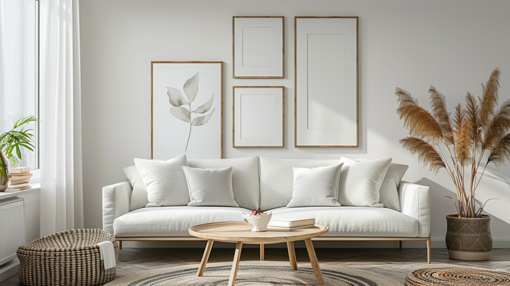
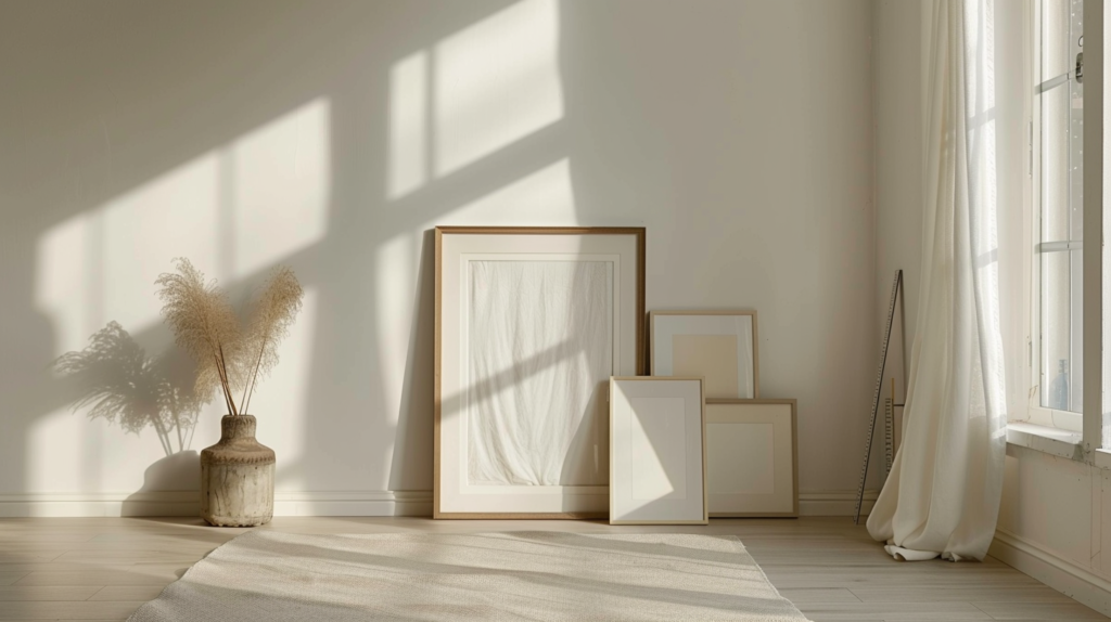
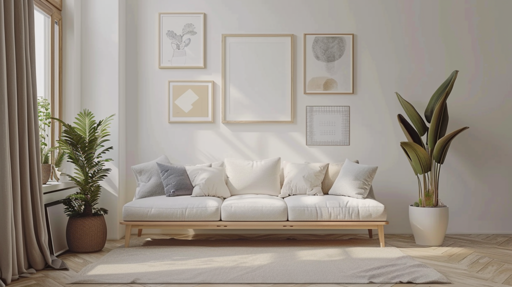
5) Gallery wall (how to make it look intentional)
Rule A: Choose a boundary
Make an invisible rectangle on the wall and keep your frames inside it.
Rule B: Keep spacing consistent
- Space frames evenly (same gap all around)
Rule C: Mix sizes, not chaos
Use:
- 1–2 bigger pieces
- a few medium
- a couple small
Pro tip: Lay it out on the floor first, then move to the wall.
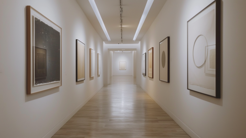
6) Hallway art (easy win)
Hallways look best with:
- vertical art pieces
- clean spacing
- a consistent frame style
Avoid tiny random frames scattered everywhere.
7) Frame + mat rules (makes it look expensive)
- Big mat board can make even simple art look premium
- Keep frame finishes consistent (matte black / oak / white)
Common mistakes (avoid these and you’ll look pro)
- Hanging art too high
- Using art that’s too small for the wall
- Random spacing
- Too many different frame styles in one view
- Putting art where it gets blocked by curtains/doors
Quick Checklist (copy/paste)
- Center at eye level
- Art width = 2/3–3/4 of furniture width
- Bottom of art = 15–25 cm above sofa/console
- Consistent spacing between frames
- One big piece > many tiny pieces
FAQ
Q1: Can I hang art above the sofa even if the sofa is against the wall?
Yes. Just keep the art connected to the sofa visually (15–25 cm gap above).
Q2: Should wall art match the room colors?
It should relate, not match perfectly. Repeating one tone from the room is enough.
Q3: What’s better: one big artwork or a gallery wall?
One big artwork is easier and usually looks more expensive. Gallery walls work if spacing and boundary are clean.
Want me to size your wall art perfectly?
Send me:
- sofa/bed/console width
- a photo of the wall
- and the style you want
…and I’ll tell you the exact layout.